Overview
Designing Trust Before the First Conversation
Before a family asks for support, it needs to feel that it has arrived somewhere safe.
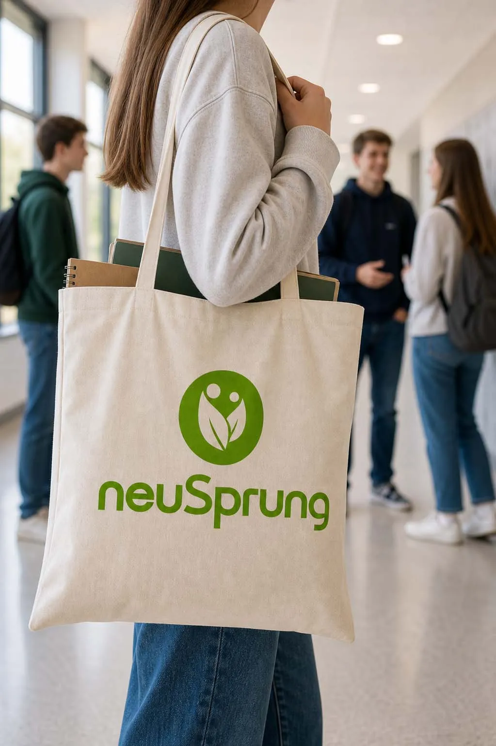
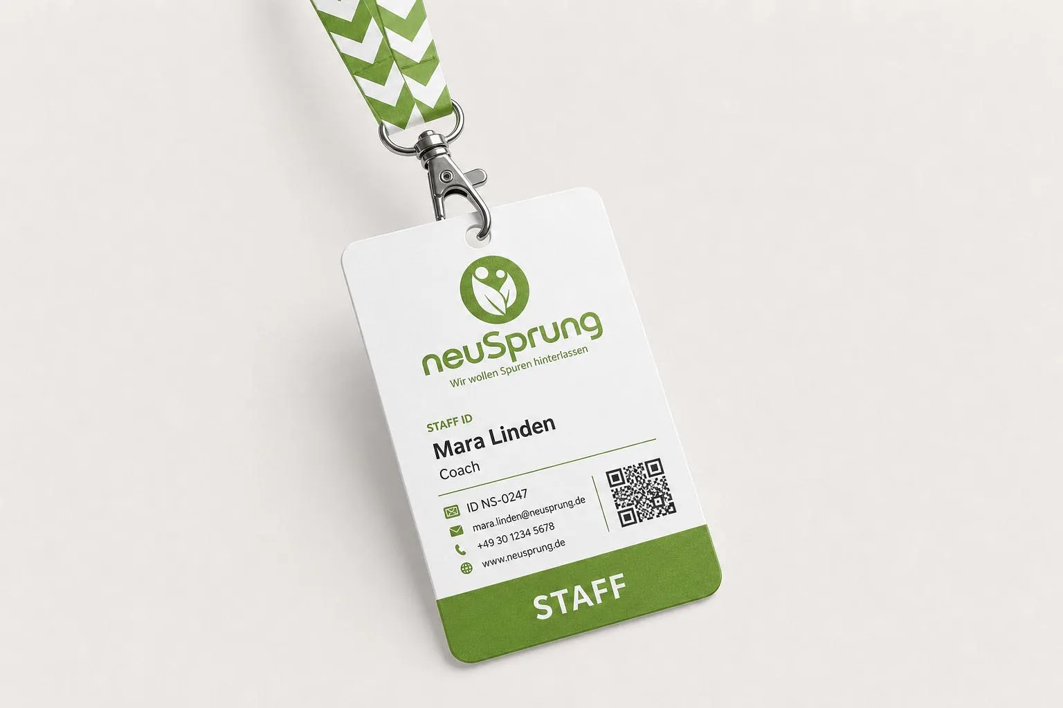
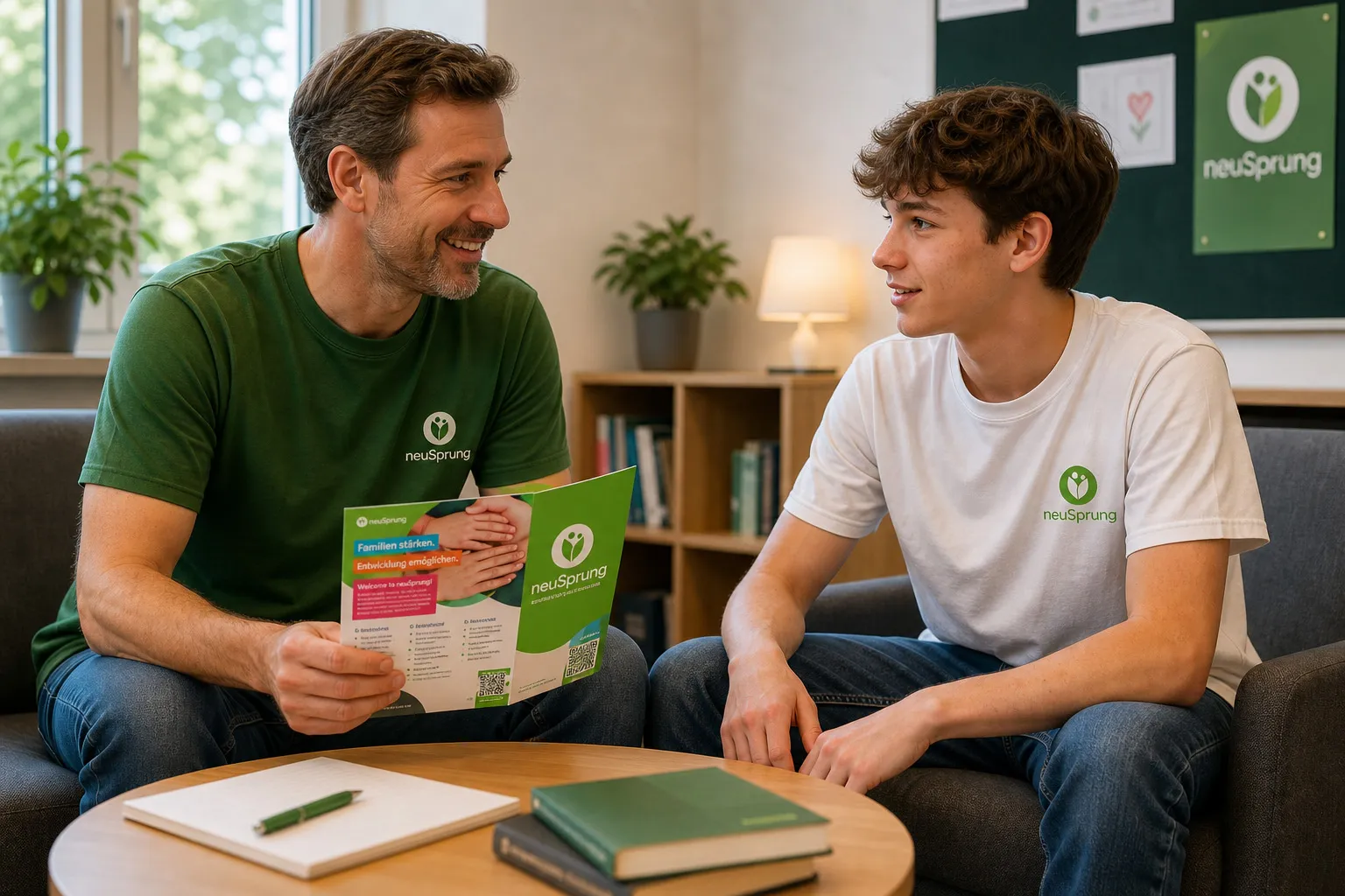
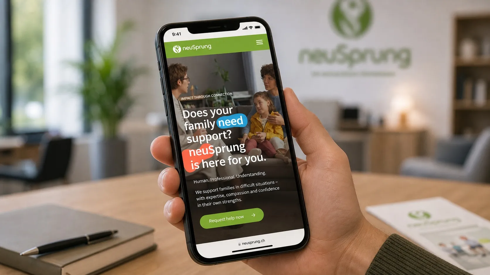
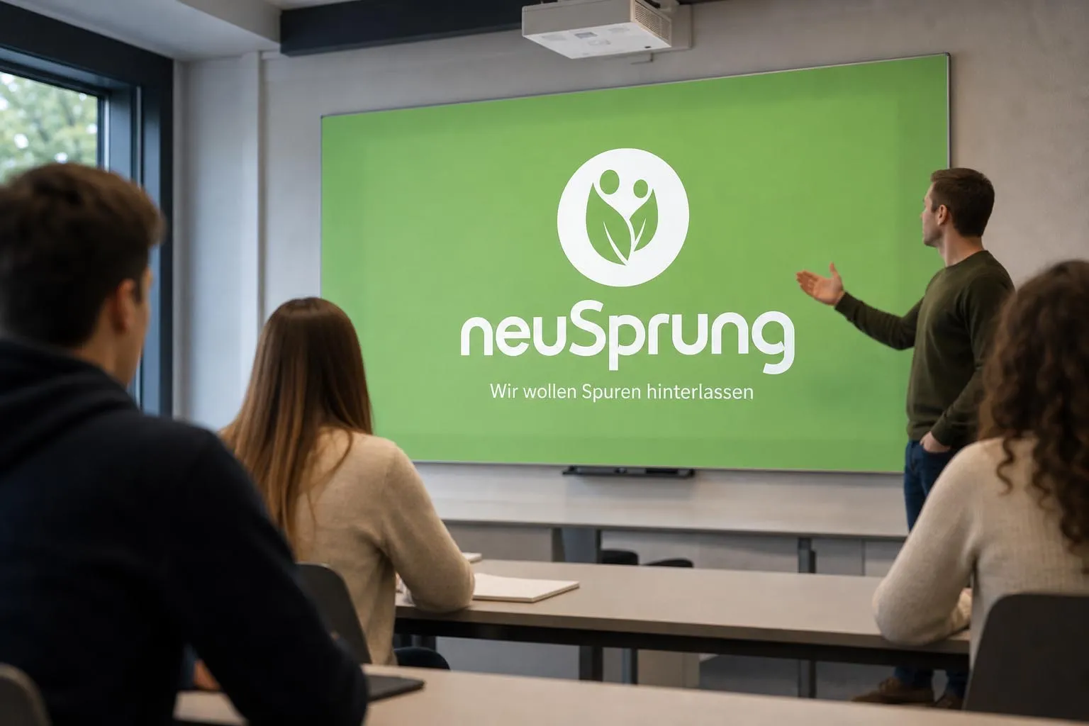
Our rebranding of neuSprung began with that moment. The organisation’s work is deeply human, but also structured, professional, and grounded in specialist expertise. The new identity brings those qualities together without making the brand feel clinical or overly institutional.
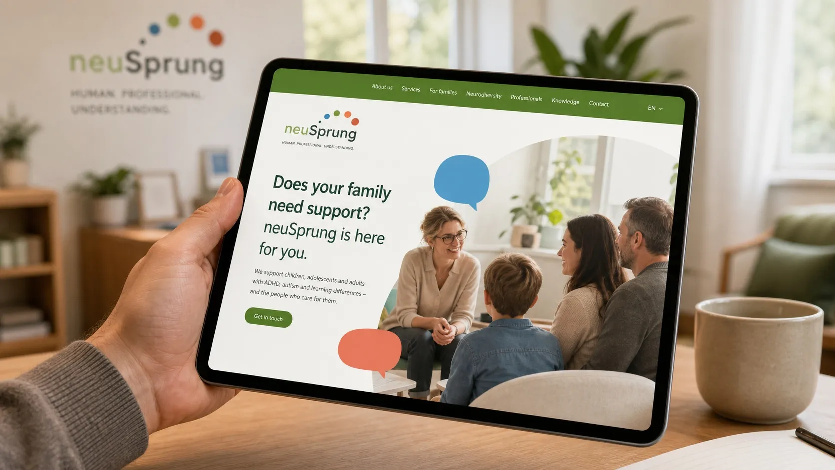
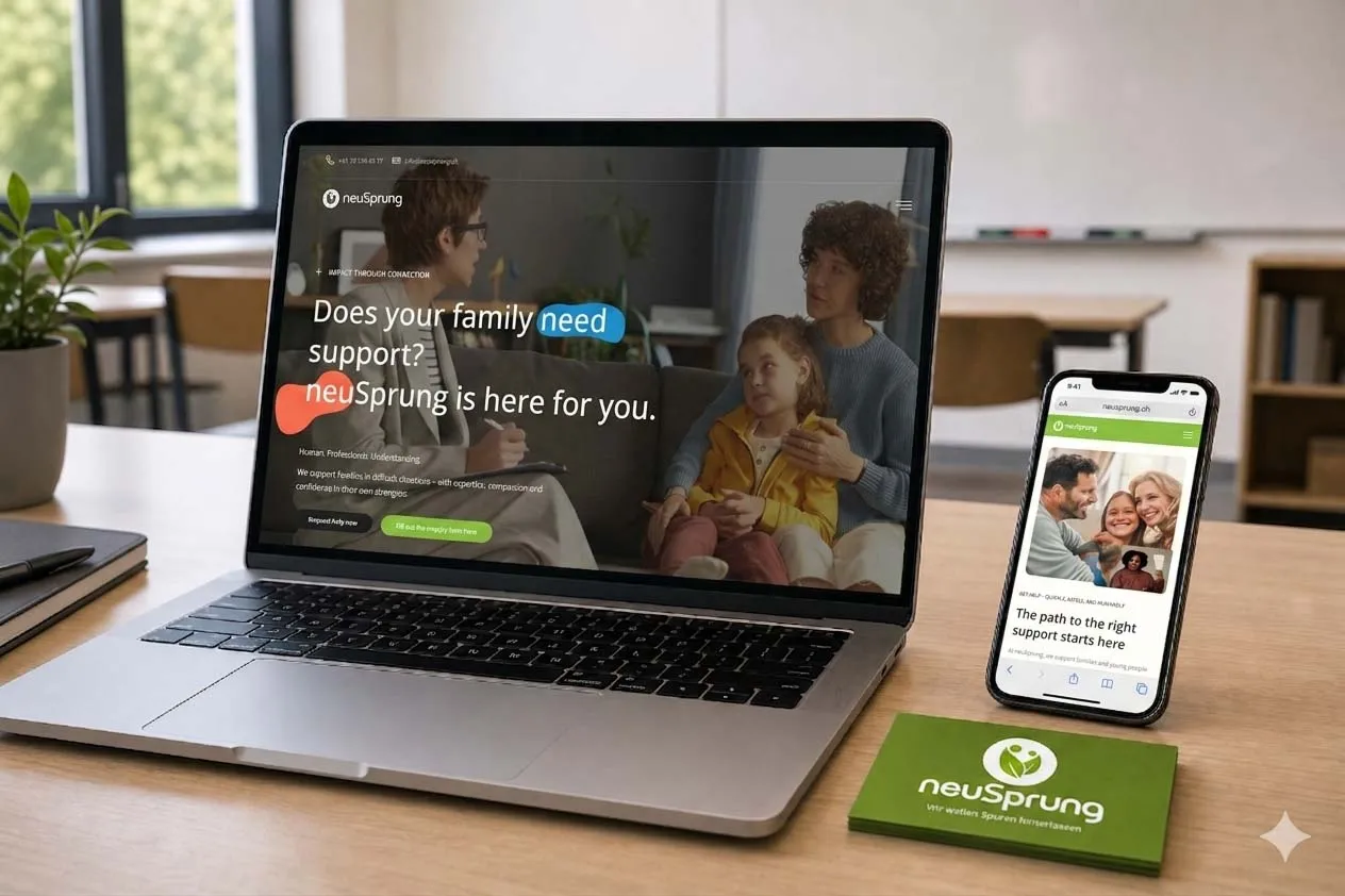
We translated the refreshed brand into a multilingual website shaped around clarity and emotional ease. Gentle visual elements, approachable typography, thoughtful imagery, and a calm interface help sensitive information feel easier to navigate, while clear pathways guide families and professionals toward the right services and next steps.
The UI/UX was designed to reduce uncertainty. Complex support processes are broken into understandable stages, service information is given room to breathe, and important actions remain visible without feeling demanding.
The result is a digital presence that does not simply explain what neuSprung does. It reflects how the organisation works: with empathy, clarity, structure, and genuine human connection.