Overview
Turning the Tap into a Mark of Trust
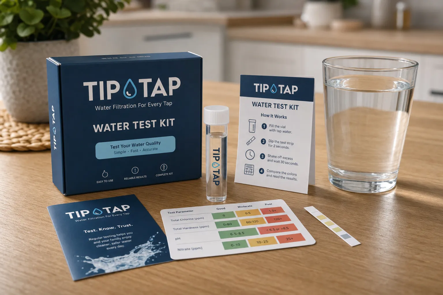
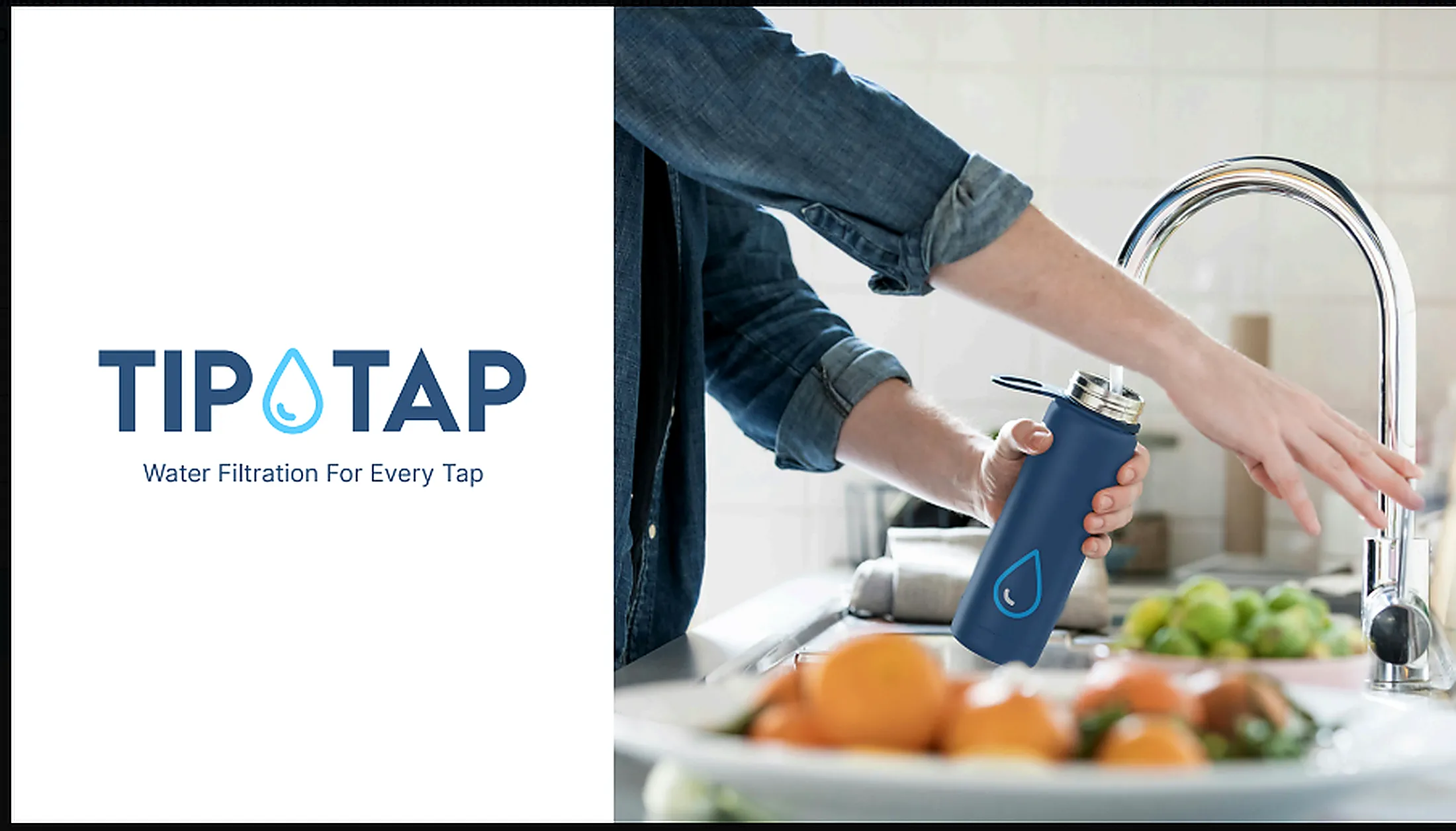
Water filtration is largely invisible. The technology sits behind the tap, the testing happens out of sight, and the difference is often understood only after the first glass. TIPTAP needed a brand capable of making that hidden value visible. We developed an identity that brings freshness and technical confidence together without making the brand feel clinical. The name’s natural rhythm became the foundation for a visual language that is direct, memorable, and closely connected to the everyday action at the centre of the service: turning on the tap. Clean typography, fluid graphic elements, and practical brand applications create a system that works wherever trust is built—from water-testing materials and service vehicles to uniforms, packaging, and the customer’s home. Rather than treating purified water as a specialist product, the identity presents it as something simple, accessible, and essential. The result is a brand designed to stay top of mind every time the tap is opened.